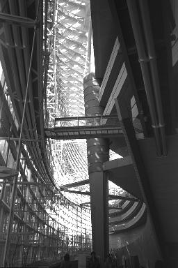
The main elements of the TIF are a 60-meter-high hull-shaped glass and steel atrium on the west end of the site and a cluster of block like buildings which runs along the east end of the site. The glass atrium is separated from the other buildings by a granite paved plaza. The atrium and other structures are linked by two levels of underground space as well as several above-ground glass-encased catwalks.
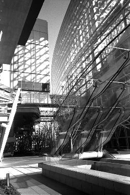
The plaza at the center of the complex is one of the more interesting aspects of the TIF. It serves not only as the entry point for the complex, but as a public space where one can gain refuge from the impersonal hustle and bustle of the surrounding Marunouchi area. Public seating is interspersed among trees and sculptures. During the hours before midday, the sun shines through the glass atrium at the east end of the complex, filling the plaza with light. Although it's an interesting place to pass through, it doesn't invite the pedestrian to linger. The height of both the glass atrium and the hulking complex opposite it dwarf the plaza and create a space which is as cavernous and inhospitable as it is impressive. |
 From the plaza, one proceeds into the Atrium, which is the main entrance
for the exhibition areas and theaters, as well as the most impressive visual element of the complex.
Its gracefully curving glass walls are a grand futuristic statement which slices its way into the otherwise drab architectural landscape around Hibiya station. The soaring space has something of the exhilarating and airy feeling of a medieval cathedral. From the inside, however, it lacks the elegant sleekness that it projects on its exterior. There is a profusion of steel structure which is almost baroque in its confusion. Semi-circular steel girders are suspended from the ceiling in a design which mimics the wooden frame of a ship. Although suspending the heavy girders between the delicate looking glass and steel walls of the atrium is a clever engineering trick, it leaves the visitor with the unpleasant feeling that the atrium is dangerously top heavy.
The group of buildings housing the theaters and reception hall at the west end of the TIF, in contrast to the atrium, are more successful on the interior. The larger of the two theaters, with seating for over 5,000 people, is a futuristic hall which has its mezzanine suspended between two immense glass paneled walls. The glass walls are lit from behind which creates the impression that the mezzanine is floating in mid-air. The smaller theater provides a more intimate space for concerts and conferences. Its stepped walls are lavishly covered in Chinese quince which lends the space a warmth which is lacking in the rest of the complex.
|
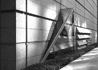
 The exterior of the group of buildings at the east end of the complex presents the most
problematic aspect of the Forum's design. Although there are technically four different block-like units,
each with a different purpose, the structures are united behind one monolithic granite facade at the west
end of the complex. At a height of approximately ten stories and running the entire length of the complex, the
facade turns a cold and unfriendly back to the neighborhood around it. Horizontal louver-shaped forms running
along the face of the wall at first appear to be air-conditioning vents but on closer inspection turn out to be
decorative. The only interruption in the seemingly never-ending granite surface is a roman-style window at its
center, a veiled reference to the architect's stated goal of creating a modern version of an Italian forum. The window is not enough to add a human dimension to the facade and one is left to perceive the wall as an unwanted bully in the Marunouchi neighborhood.
All in all, one cannot help but be a little disappointed by the Tokyo International Forum. The lavish use of granite, steel and glass as well as the futuristic design are impressive to be sure. Somewhere along the way, however, the architect seems to have lost sight of the goal, which was to create a forum, or center for public interaction. In an attempt to include the largest possible exhibition areas and theaters in the most dazzling edifices, the TIF became too massive a complex for its small plot of land, thus losing its human dimension. The TIF does not stretch out a welcoming hand to the city around it. If it does manage to attract many visitors, other than those who come for the concerts and exhibitions, it will be for the novelty of its sleek glass atrium and futuristic trappings. Once the novelty wears off, however, it will probably be regarded mostly as an expensive monument to the bloated age during which it was conceived.
Copyright (c) 1997, Max Bolstad
|
| NEXT | Asahi Beer Hall |
|
| |
|
|
Architecture table of contents |
|
| |
| bento.com main menu | |
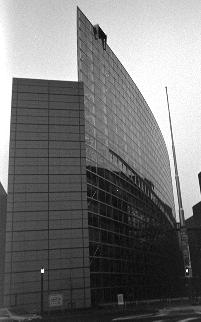 If one looks at the TIF in its entirety, it is interesting to see the progression the structures
make from solid heaviness to ethereal lightness moving from east to west. The fortress-like qualities of the granite eastern facade give way to the less severe granite, glass and steel of the walls facing the plaza. At the west end of the plaza lies the atrium, so open that light can easily pass through it. The progression would seem to be symbolic of the opening of Japanese culture to the outside world and the TIF's goal of increasing the internationalization of Tokyo.